
Sharingbox
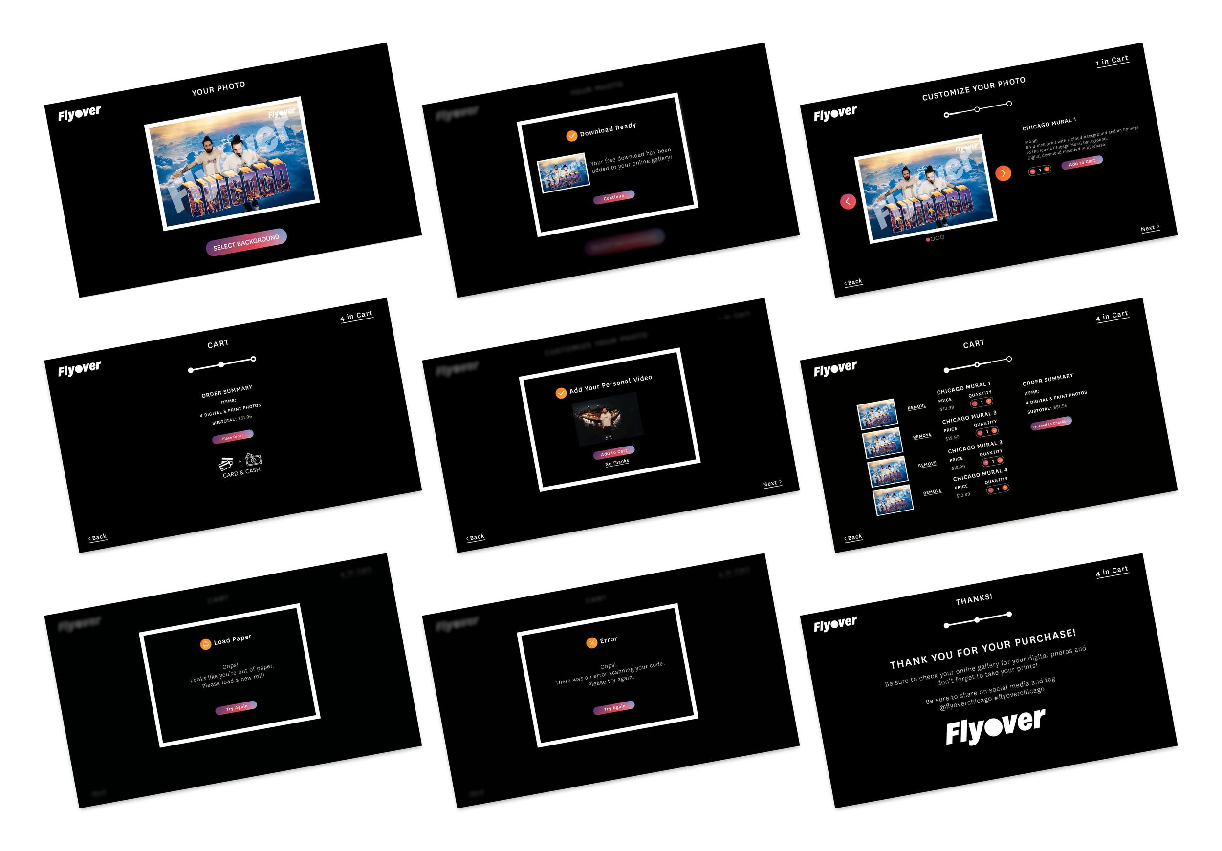
Sharingbox offers photo booth rentals for a variety of events. Flyover Chicago is an interactive event where people can immerse themselves in the city from a different perspective. Sharingbox and Flyover Chicago partnered to provide a way for people to preserve their memories of this event by purchasing a souvenir at the Sharingbox photo booth.
Project Details
Company: Sharingbox and Flyover Chicago
Project dates: October 2023 - January 2024
My Role
UX Designer
User Experience Design | User Flows | User Research | User Interface Design | Information Architecture | Prototyping | Wireframing
The Challenge

The Problem
XXXXXXX
Requirements
There are two main parts of the security onboarding and the following requirements were given for each.
Account Password: It is important to require users to create strong passwords to protect their accounts and the data that they are storing on the platform. Below are some password tips:
Length: Choose a password that is at least 6 characters long. Longer passwords are generally more secure and harder to crack.
Complexity: Use a mix of uppercase and lowercase letters, numbers, and special characters to make your password more complex and difficult to guess.
Avoid common patterns: Avoid using common patterns or sequences in your password, such as "123456" or "password".
Avoid personal information: Do not use personal information in your password, such as your name, birthdate, or phone number.
Use a unique password: Do not reuse the same password across multiple accounts. If a password is compromised on one account, it can lead to other accounts being compromised as well.
Password manager: Consider using a password manager to generate and store complex and unique passwords for each of your accounts.
Two-factor authentication: This is a highly recommended security feature, and users should be strongly encouraged to set it up as part of their account setup process. Users typically need to provide a phone number or email address to set up two-factor authentication. They can receive an email confirmation, or receive authentication codes via text message.
Competitive Research
To begin the process, I conducted competitive analysis of direct competitors and best in class SaaS platforms.
Knowing there would be some sort of password screen, I focused on gathering research for this first. Some of the best examples I found are below. A common theme between these is showing the user the password requirements in some way. Hubspot does a good job of communicating this information by checking off each requirement as the user types in a password and displaying this information in an easy to read way.
Almost all examples have the option to show/hide the password so this was a feature I marked to include. This will help users who forget what the type or might mistype a character, which will make the process quicker.

I also looked at the second requirement: two factor authentication (2fa). I found most examples I looked at did 2fa via phone number, with an option to text or call a code. After discussing these options at a design meeting with the founder and lead designer, we decided the phone call wouldn’t be able to be included in the MVP. We also discussed the use of “magic links” (sending the user a link to click) instead of having users enter a code.

Based on this discussion, I did more research on products that use magic links. Slack is one of the most common examples and one I looked at for the “link sent” screen.

While not all the above examples are sending 2fa links, they are the best examples of a waiting screen for users that confirms the 2fa link/code has been sent. Mixpanel includes a crucial feature: allowing the user to resend a code.
I knew I wanted to include a success message or screen so users know they have completed the process and feel a sense of accomplishment, especially since security settings are so important.

Additionally, I wanted to do research on different progress bars for onboarding processes with only a few steps. I had done some previous research (and designed a progress bar) for the customer onboarding.
However, I was not sure if the same progress bar would be the best design for this shorter process. Having more than one progress bar would be useful for our design system as well in case this need came up in the future.

Solution
User flow
Based on the requirements and the competitive research as well as the work done in the customer onboarding sprint, I created a user flow for security onboarding.

Low Fidelity Wireframes
For the first low-fidelity wireframes, I wanted to focus on the content of the screens. The first step would be setting up a password (for users who did not do this already). In order to simplify the onboarding process, we will allow users to create an account without a password using SSO or a magic link. Then, when they sign in for the first time, they can create a password.
The second step was setting up 2fa. At this point, we included an option for 2fa via both email and SMS.
The third step was confirming the 2fa and showing the user a success screen. Some of this happens outside of the platform in the user’s email or phone, which was not designed yet. I decided a pop up works better than a full screen design. This was based on the small amount of information being asked from the user and because this process is triggered after a user logs in.

Mid Fidelity Wireframes
After getting feedback from the design team and stakeholders, I created a more robust mid fidelity wireframes. Some feedback I received was that the screens needed to be more interesting, the steps needed to be broken down more, and users needed the option to go back in the process.
Starting with the progress bar, I made a visual indicator of each step while still including the text to inform users of what step in the process they are on. This will help users easily see the progress they are making and makes screens more interesting. I also added the password requirements on this screen with responsive checks that will show as the user types.

For step 2, I added a selector to make the process clearer. Users will select which option (email or phone or both) they want to use to set up 2fa. For the phone option, I included a future design to use when we expand to phone calls for 2fa (crossed out for now since it won’t be included in the MVP).

Additionally, I added a screen to confirm the link was sent and allow users to resend the link. For the success screen, I added sample copy and illustration to liven up the page. Since we discussed having more onboarding processes, I decided to add an option on this screen for users to move to the next suggested onboarding goal.

Prototype
The final prototype is linked below. Since this process takes place in a pop up, a sample dashboard from Dashbord Kit was used as the background.
Next Steps
For next steps, the following areas can be improved upon:
1. More user testing
Doing testing on real users once the product launches would be the first thing I’d do were I to continue on this project. While feedback from stakeholders and others on the team was immensely helpful, getting feedback from real users will help us iterate and improve.
2. Design phone call 2fa process
This is planned for once the product launches. Adding an option for users to set up 2fa via phone call needs to be designed and developed. The magic link process we use for SMS wouldn’t work for a phone call so we would need a different option. One option for this would be a code users enter on their screen.